Brief Description
We now know that the best way to summarize market action is through open (O), high (H), low (L), and close (C). Now we have to see on which type of chart all this information can be best viewed. If the technique of the chart is not good, then viewing the chart can be a bit difficult. The four most important pieces of information in any day trading is OHLC. If we look at the 10-day chart, we get 40 data points i.e. four data points for every day. Now you must have understood that if we want to see the chart for 6 months and even more for 1 year then how many more data points have to be seen.
By now you must have guessed that the commonly used charts like column charts, pie charts, area charts, etc. are not useful in technical analysis. Out of this, only one chart is useful in technical analysis and that is the line chart. This is because the commonly used charts show only one data point whereas technical analysis requires at least 4 data points.
There are a few types of charts:

Line charts
Bar charts
Japanese candlesticks
We will go into more detail on candlestick charts, but first, let’s understand why not use line charts and bar charts.
Line and Bar Charts
Line charts are the most straightforward and easy-to-use charts. There is only one data point in this and on which this chart is prepared. In technical analysis, a line chart is made for only one thing – the closing price. This chart can be of stock as well as index. For each day’s closing price, a point is drawn on a chart and then all those points are connected by a line to form a line chart.
If you are looking at 60 days of data, then a line is drawn by adding the closing prices of all those days and a line chart is made. as you can see in the image below.

Line charts can be created for different time frames like month line chart, week line chart, hourly line chart, etc. If you want to make a line chart of the week, then you have to put the closing price of the week on a chart and join them on the line.
The biggest feature of a line chart is that it is very simple and straightforward. Any trader can spot a trend by looking at it. But its directness and simplicity is also its biggest weakness. A line chart can only indicate a trend and nothing else. Apart from this, the other weakness of the line chart is that it is built only on the basis of the closing price and does not take into account other data points like open high and low. That’s why traders do not use line charts much.
A little more data can be entered in a bar chart than in a line chart. Like OHLC can show all four in it. A bar chart has three parts.
Central Line – The upper part of the bar represents the highest price, while the lower part of the bar represents the lowest price.
Left Mark / Tick – This indicates the open (O) price at the time of opening.
Right Mark / Tick – This shows the close (C) i.e. the closing price.
For example, suppose the data for a stock is as follows:
Open – 65
High- 70
Low – 60
Close – 68
The bar chart for this data would look something like this:

You can see that four different prices can be displayed on a single bar. Now if you want a five-day chart, you have to make five such bars.
Pay attention to the left and right marks of the chart. You will see how the market has gone up and down on that day. The left mark which shows the open price of that day is below the right mark. This means that the close price is above the open price i.e. it was a good and bullish day for the market. Consider this for example where O = 46, H =51, L = 45 and C = 49. The bar is shown in blue to show this.

Similarly, if the left mark is above the right mark, then it indicates that the close is below the open, which means a bearish or bad day for the market. Look at this example: O =74, H = 76, L =70, C =71. The bar is shown in red to indicate that it was a bearish day.

The length of the middle line i.e. the central line tells in which range the market was on that day. Range means the distance between the highest price in the market and the lowest price. The bigger the line, the bigger the range, and the smaller the line, the smaller the range.
Although the bar chart shows all four data points, it is still not very good to look at. This is the biggest weakness of the bar chart. This makes it a bit difficult to spot a pattern easily, especially when you have to look at multiple charts a day. That’s why traders use bar charts less often. But if you are new to the market then our advice would be to use Japanese candlesticks. Most of the traders in the market use candlestick only.
History of the Japanese candlestick
Before proceeding further it would be good to know the history of Japanese candlesticks. As the name suggests, the candlestick originated in Japan. It was first used by a rice merchant in Japan in the 18th century. Although it is being used for price analysis in Japan for a long time, but the western countries did not know anything about it. It is believed that a trader named Steve Nison found it in 1980 and then told the world how to use it and how it works. He also wrote a book on it – “Japanese Candlestick Charting Techniques”. Still, this book is very popular.
Many names associated with candlestick techniques are still Japanese names.
Candlestick Structure
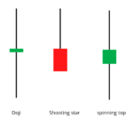
In bar charts, open and close prices are shown as ticks or marks, which are to the left or right. Whereas in candlestick the open and close prices are shown as a square rectangle i.e. Rectangle. A candlestick chart has both a bearish candle and a bullish candle. Bullish candles are shown as blue-green or white and bearish candles as red or black. Well, you can change these colors anytime and add any color of your choice. Technical Analysis software lets you change colors. In this module, we have selected blue-colored candles for bullish, and red-colored for bearish.
First, let’s look at the Bullish candle. Like a bar chart, a candle shape consists of three parts.
Central real body – The main part which is rectangular and connects the open and close price.
Upper Shadow – Connects the high (highest price) with the close price.
Lower Shadow – Connects the low (lowest price) to the open price.
See this picture to understand how a Bullish Candlestick is formed.

Now let us understand this with an example. Let’s say the prices are:
open = 62
HIGH = 70
lo = 58
close = 67

Similarly, the Bearish candle also has three parts.
Central body – The rectangular main body that connects the open and close prices. However, the opening is at the top and the closing is at the bottom of the rectangle.
The upper shadow ie the upper shadow – connects the high point with the open.
Lower shadow (lower shadow) – connects the low point with the close.
The bearish candle looks like this:

Now let’s see with an example. Suppose the prices are as follows:
open = 456
high = 470
low = 420
close = 435

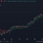
We can easily plot candlestick charts with the help of some free online tools like Tradingview.com, investing.com. Once you know how to plot candlesticks, it will be easier for you to understand patterns by reading candlesticks. If you were to plot a candlestick on a time series, it would look like this. The blue candle is bullish and the red candle is bearish.

Take a look, long candles indicate overbought while short candles indicate under-trading. The price volatility is also less during small candles. Overall, candlesticks are easier than bar charts – to understand and identify trends. With the help of a candlestick, you can more easily understand the relationship between open close high and low points.
Some things Related to Time Frames
The time period or time frame is the time for which you want to view the chart. Some popular time frames or time periods are;
monthly or monthly chart
weekly or weekly chart
day or daily chart
Intraday Charts – 30 Minutes, 15 Minutes, and 5 Minutes
The time period can be changed according to your need. For example, a trader can also look at a 1-minute chart if he needs to trade quickly.
Statistics or data can give you useful information and can also give unnecessary information. As a trader, you have to choose between having too much information. For example, a long-term investor should look at weekly or monthly charts as this will give him an idea of his actions, whereas an intraday trader should look at daily charts or 15-minute charts. A trader doing a lot of trades in a day will get a 1-minute chart about his work. So you must have understood that you should choose the time period according to the information of your need.
Highlights of this chapter
- Simple charts are not useful in technical analysis because 4 data points cannot be shown at the same time.
- The trend can be shown through the line chart but other than that it cannot be used for anything else.
- Bar charts are not very easy to see and hence it is a bit difficult to extract a pattern from it. That’s why bar charts are not very popular.
- There are two types of candlesticks – Bullish candle and Bearish candle. However, the structure of both types of candles is the same.
- When the close price is above the open price it is a bullish candle and when the close price is below the open price it is a bearish candle.
- The time period plays a very important role in the success of the deals. Any trader should use it very carefully.
- When the time period increases, the number of candles increases.
- A trader should be able to extract information about his work.

Gaurav Heera is a leading stock market educator, offering the best stock market courses in Delhi. With expertise in trading, options, and technical analysis, he provides practical, hands-on training to help students master the markets. His real-world strategies and sessions make him the top choice for aspiring traders and investors.